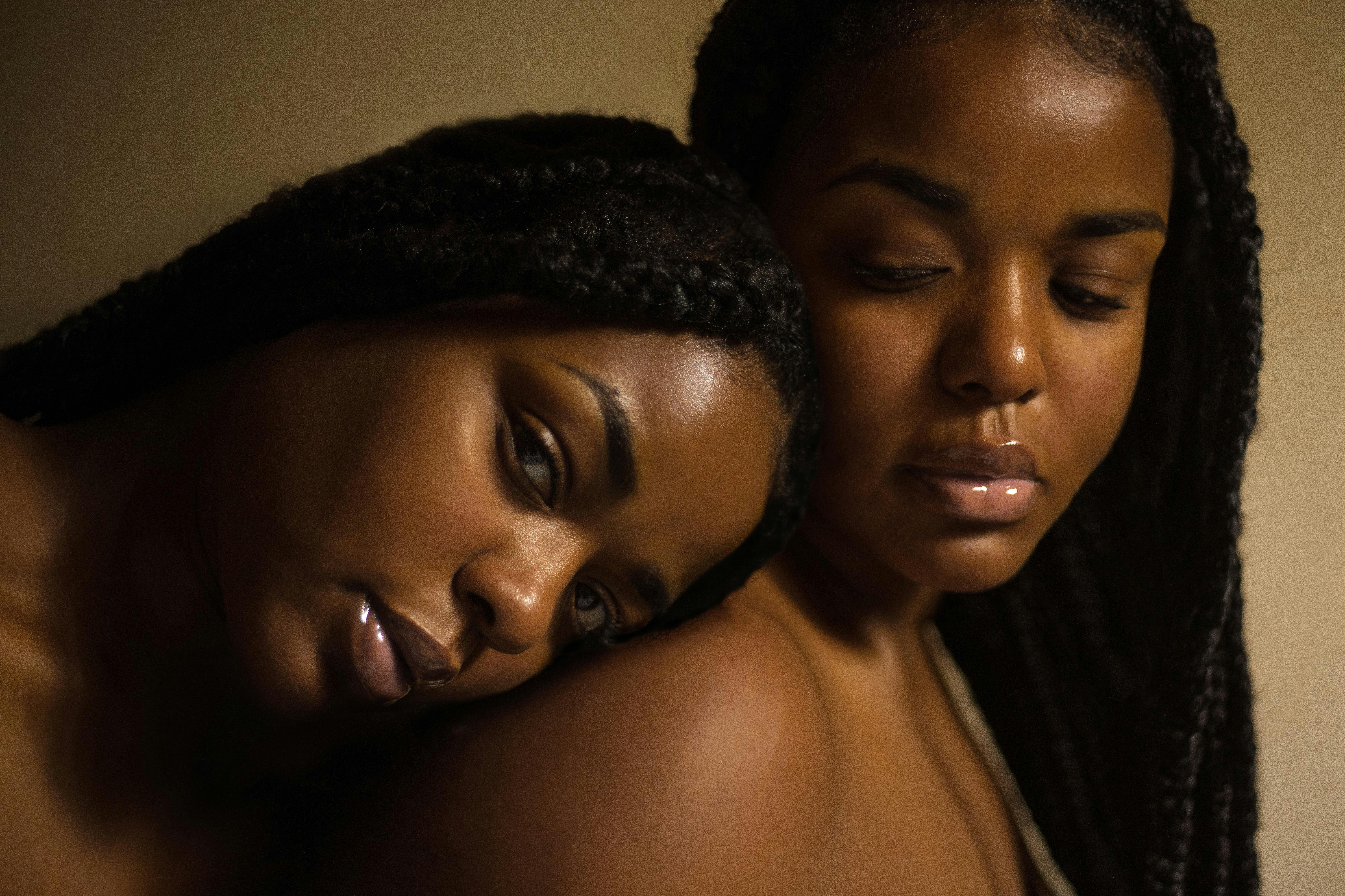
Lumea Brand
A new skincare brand built with a clean, modern identity.
CATEGORIES
HOME COOK MARKETPLACE | Q2 '26
Visual Storytelling
Content & Marketing Assets
Product Branding
CLIENT
Lumea Organics
DURATION
6 weeks

Challenge
Lumea Organics was launching into a crowded skincare market and needed a brand identity that felt trustworthy, minimal, and modern. Their challenge was standing out while also projecting a sense of authenticity and sustainability.
Approach
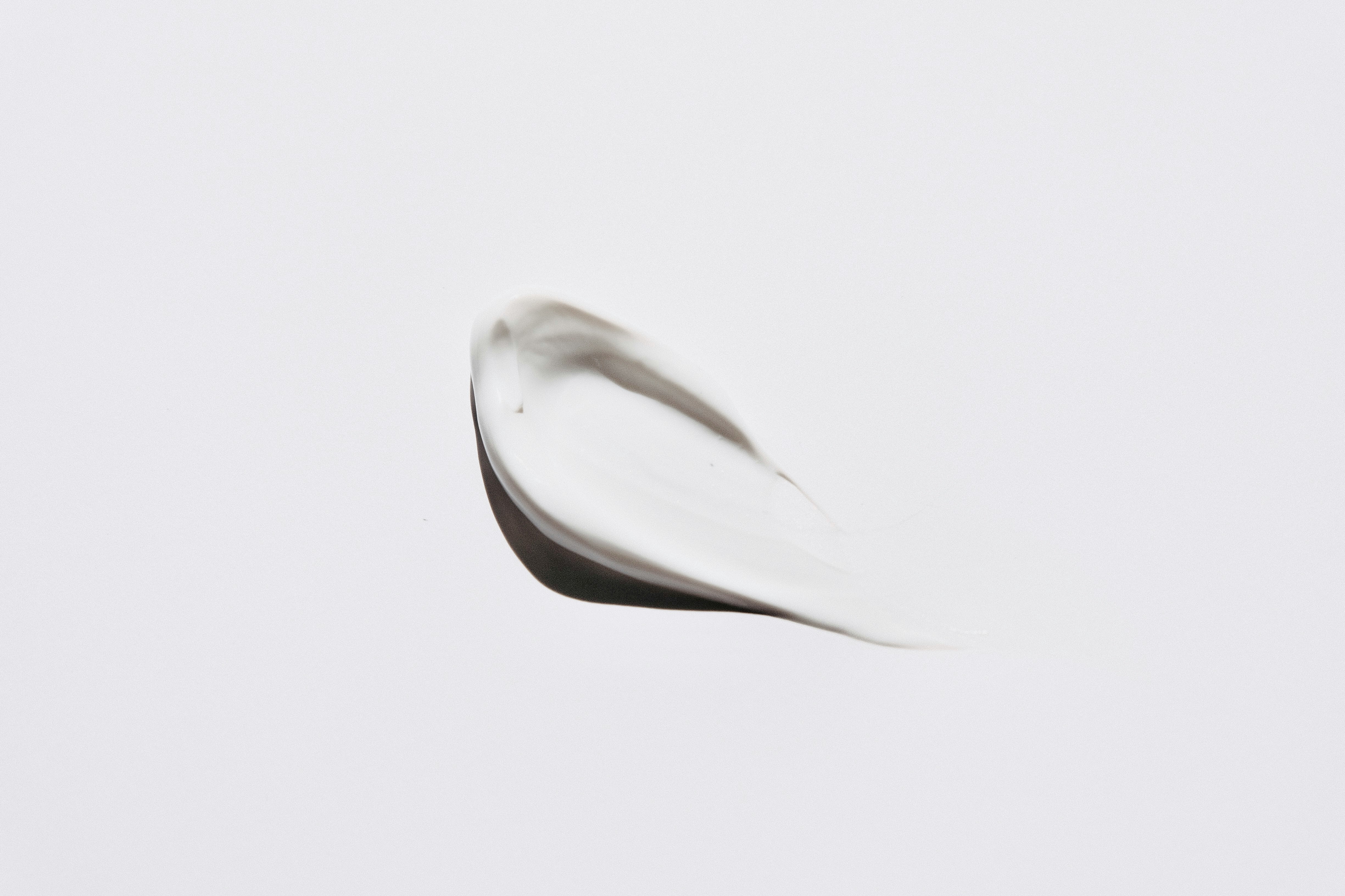
I began with research into the skincare and wellness landscape, identifying opportunities for differentiation. We explored natural palettes, refined typography, and a visual storytelling approach centered on transparency and care. Alongside logo development, I designed packaging concepts and a flexible identity system adaptable to digital and print.

Outcome
The result was a timeless brand identity with a soothing visual language that communicated trust and purity. The clean design helped Lumea position itself as a premium yet approachable brand. Early campaigns received positive feedback, and the identity proved scalable across product lines, packaging, and digital platforms.

Other Projects


Explore the full archive →